UCIL20401 & UCIL20421
Visualising Information: Uses and Abuses of Data
- Semester 1
- Blended delivery
- 10 credits and 20 credits
"A picture is worth a thousand words," but only if you know how to read it.
This course, led by Senior Lecturer in Digital Humanities and History, Dr Luca Scholz teaches you how to engage with information visually.
Digital technology has made charts, maps, and data visualisations easier to create and share than ever. Whether we consider climate change graphs, invasion maps, or visualisations of artificial intelligence, well-designed charts and maps can be enlightening, but they can also be ambiguous or misleading. Indeed, we are often ill-equipped to approach visualised information critically.
This unit is a mixture of online modules and face-to-face seminars.
This course does not involve any coding and does not require any previous technical knowledge.
About
Visualisation of data
You will learn to recognise and critique oversimplifying, biased, or misleading forms of visual representation and create your own visualisations.
Through examples from a wide range of academic disciplines - including such fields as economics, literature, meteorology, history, urban design, and computer science - you will discover key principles of exploratory and public-facing data visualisation and learn how to create your own charts and maps.
Historically, data visualisation has often been used to discriminate, control, and police. In this course, you will also explore interventions by critical data scientists, scholars, and activists who visualise data to expose injustice, challenge unfair classification systems, and speak truth to power.
The course allows you to formulate your own questions and answer them using a suite of digital tools that allow you to develop and present your argument through visualisation and narrative.
Unit information
What do you need to know about this unit?
Visualising Information: Uses and Abuses of Data
UCIL20401 (10 credits)
UCIL20421 (20 credits)
We have a one-hour taster of this unit, you can get a feel for the online teaching and content of the unit.
TRY AN ONLINE UCIL UNIT TASTER
- Level 2
- 10 and 20 credits
- School of Arts, Languages, and Cultures
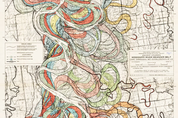
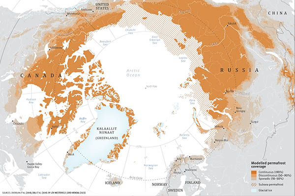
- Explore uses (and abuses) of visualised information in different domains of knowledge, from infection charts to invasion maps.
- Allow you to master to some of the most important data visualisation tools used across disciplines to create interactive visualisations, maps, and network graphs
- Help you, regardless of your discipline or background, to become more vigilant and reflective users of visual information
- Enhance your employability by allowing you to develop technical, critical, and creative skills needed to thrive in sectors that work with data and visual information
On successful completion of the unit you will be able to:
- Identify the opportunities and limitations of data visualisation
- Decide when a visualisation tool can be useful for specific questions in your subject area.
- Critically reflect on how data modelling and visualisation choices influence the interpretation of the data
- Evaluate different types of projects undertaken in text mining, network analysis, and digital mapping.
- Use digital tools to collect, analyse, and explore different types of data, and create high quality maps and charts
- Present information and arguments orally, verbally and visually with due regard to the target audience
- Apply skills and concepts learned in class to plan, develop and present a research project (for 20 credit students)
10 Credits
- Why We Visualise
- Visual Variables
- Thinking with Charts
- Visualising Space: Maps
- Deceptive Visualisations
20 Credits
- Why We Visualise
- Visual Variables
- Thinking with Charts
- Visualising Space: Maps
- Deceptive Visualisations
- Envisioning Connection: Networks
- Beyond Numbers: Qualitative Visualisation
- Visualising Uncertainty
- Data Visualisation and Social Justice
- Vision and Knowledge
The unit includes contributions from leading researchers from a broad range of disciplines, including history, computer science, sociology, and meteorology and others.
The unit is made up of 5/10 online modules (released at intervals) and 5/10 face-to-face seminars that include practical tutorials and discussions in the Digital Humanities Lab, which is equipped with computers and large screens.
The unit is interactive and uses a variety of learning materials, including historical and contemporary visualisations from a broad range of disciplines.
10 Credits
- Ongoing assessments (10%)
- 500-word critical discussion of a self-selected visualisation (35%)
- 1500-word essay with a self-designed visualisation (55%)
20 Credits
- Ongoing assessments (10%)
- Presentation of a visualisation: use one of the technologies learned to develop a basic visualisation and present it in oral and written form (5 minute presentation & 500 word report) (35%)
- Written Task (choice of Essay or StoryMap) with self-designed visualisation (3000 words) (55%)
Dr Luca Scholz with leading scholars from across The University of Manchester.
Eligibility
UCIL units are designed to be accessible to undergraduate students from all disciplines.
UCIL units are credit-bearing and it is not possible to audit UCIL units or take them for additional/extra credits. You must enrol following the standard procedure for your School when adding units outside of your home School.
If you are not sure if you are able to enrol on UCIL units you should contact your School Undergraduate office. You may wish to contact your programme director if your programme does not currently allow you to take a UCIL unit.
UCIL units are designed to be accessible to undergraduate students from all disciplines. Depending on your School enrolment can be completed in one of two ways:
Enrolment using the Course Selection System
You may be able to enrol directly onto a UCIL unit using the Course Unit Enrolment System.
Enrolment via your School
If you cannot see the UCIL unit you wish to study or it is blocked out on the Course Unit Enrolment System you may need to request approval to study the unit directly from your School.
Please get in touch with the UCIL team at ucil@manchester.ac.uk if you have any questions.
Student testimonial
I consider this one of the best courses I studied. This course is truly interdisciplinary - it reaches beyond the basics of data visualisation and covers data activism, data storytelling, the grey zone between data visualisation and art, and more. The online modules are incredibly engaging.
Maria Nukui
Psychology student